
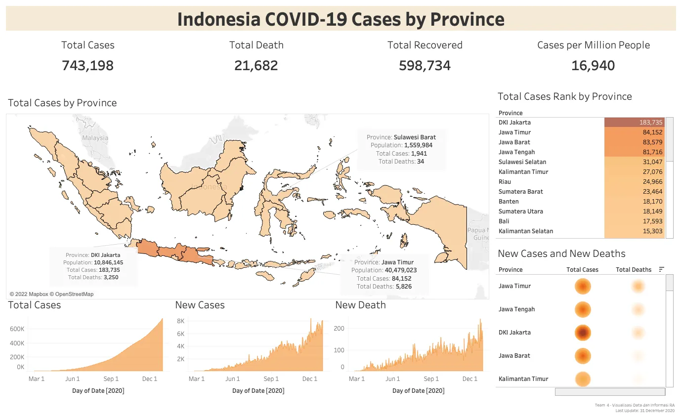
During the height of the COVID-19 pandemic, I took on the challenge of making complex public health data accessible and understandable. Using a large dataset from Kaggle, I developed a series of interactive dashboards in Tableau to visualize the spread of the virus across Indonesia. The goal was to transform raw statistics into clear, eye-catching visuals—including graphs, diagrams, and geo-mapping—that allowed viewers to easily track trends and understand the situation at a glance.
- Technologies Used: Tableau
- View Visualization